
NASA X CARAN D'ACHE
Product & Packaging Design, Art Direction
I have been looking at ideas for dream projects for a while and the idea of combining two of my favorite design classics; Caran D'ache's iconic 849 ballpoint and the NASA brand manual felt like a good place to start.
Most of the work here was completed over a weekend and was intended to help em develop my 3D modeling and lighting skills. It also led me to rediscover Vantablack, the world's most light absorbing material and put it into practical application.
Assets Created
3D Modeling
Packaging Concept Design
Product Design
Development
Pen Design
The six designs were selected based upon NASA's brand standards' Pantone references, followed by applying the appropriate finishes and materials to make each unique.
Special treatments included the black chrome which is a nod to materials used on space crafts and to a series of photographs of astronaut's visors.
The Vantablack edition, which has the appearance of a mis-render, is actually a special coating that has been around for a couple of years that is able to absorb all surrounding light, and therefore when photographed appears as a flat silhouette.
The blue edition takes the stars and dot motifs from NASA's insignia and reassembles them to create a light-hearted pattern on the pens body.

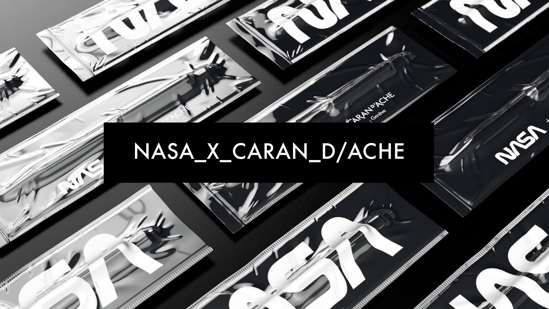
PACKAGING DESIGN
BOX SET 1 - GENEVE MISSION PACK

PACKAGING DESIGN
INDIVIDUAL BLISTER PACKS

PACKAGING DESIGN
VANTABLACK (TM) EDITION
